GUIDANCE SYSTEM
The guidance system for slow, pedestrian-oriented traffic in Gmunden does not understand orientation as a purely functional task, but as a spatial, social, and processual act, with the goal of providing clear, intuitive guidance beyond conventional traffic signs while also enhancing the public realm through thoughtful design.
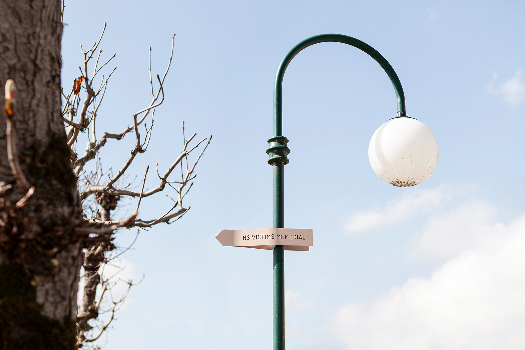
The central element of the system consists of arrows serving as signposts, mounted on white, maritime-inspired poles using proven but concealed clamps. Installation, replacement, and expansion are straightforward and standardized. A distinctive mast top references a navigational sign and brings the Traunsee lake as a visual landscape motif into the city center. Four colors derived from the urban context – Traunsee blue, Markt awning green, Old Town facade pink, and Strandbad yellow – organize information into the categories “Art & Culture,” “Tourism & Recreation,” “Infrastructure,” and “Old Town Orientation.” The color concept is designed as a long-term system and is intended to be applied in future urban design tasks to strengthen the identity of the cityscape.
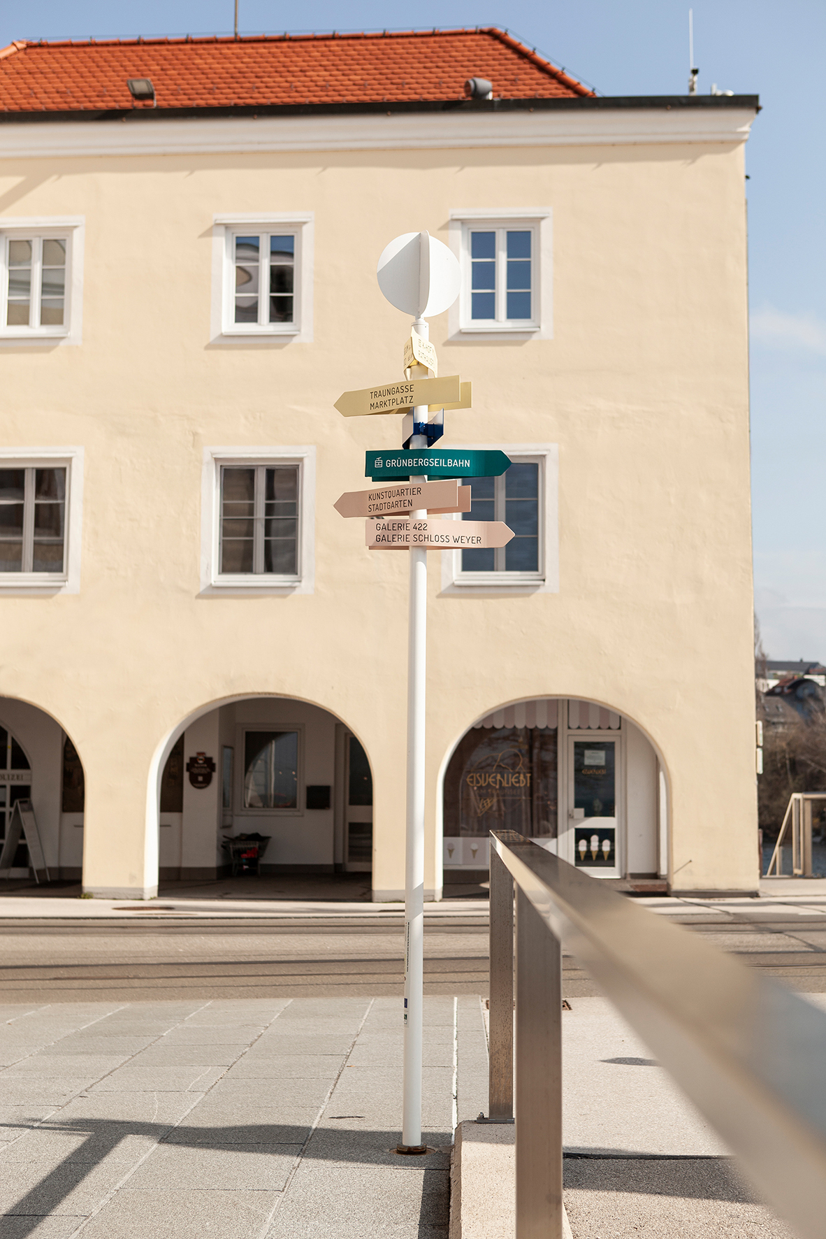
Building on the city’s existing corporate design, a typeface was defined, custom signage icons were developed, and the city map was updated to align with the new design. All elements, including metalwork, laser engravings, and powder coatings, are produced regionally. The project supports local value creation, ensures high craft quality, and reduces transport distances.
Across both processes, we continuously support the municipality of Gmunden in design-related matters. Existing structures are assessed, the space is carefully cleared, and subtle interventions are implemented. Prior to the installation of the shared space, a vacant building was used as an open construction office and citizens were invited to participate in the process. The project is conceived as an ongoing initiative and regards design as a long-term, careful process of urban stewardship.
Supported by Leader Traunsteinregion